Corpus plots
ruts.visualizers.dispersion_plot(), ruts.visualizers.keyness_plot(), ruts.visualizers.collocation_network()
Description
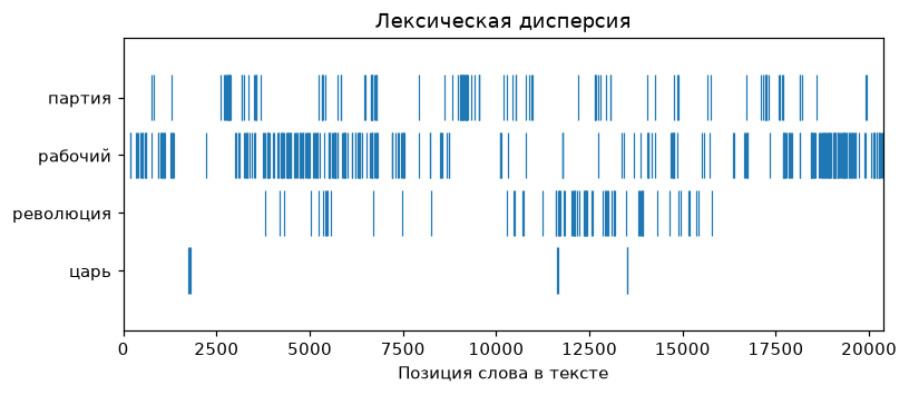
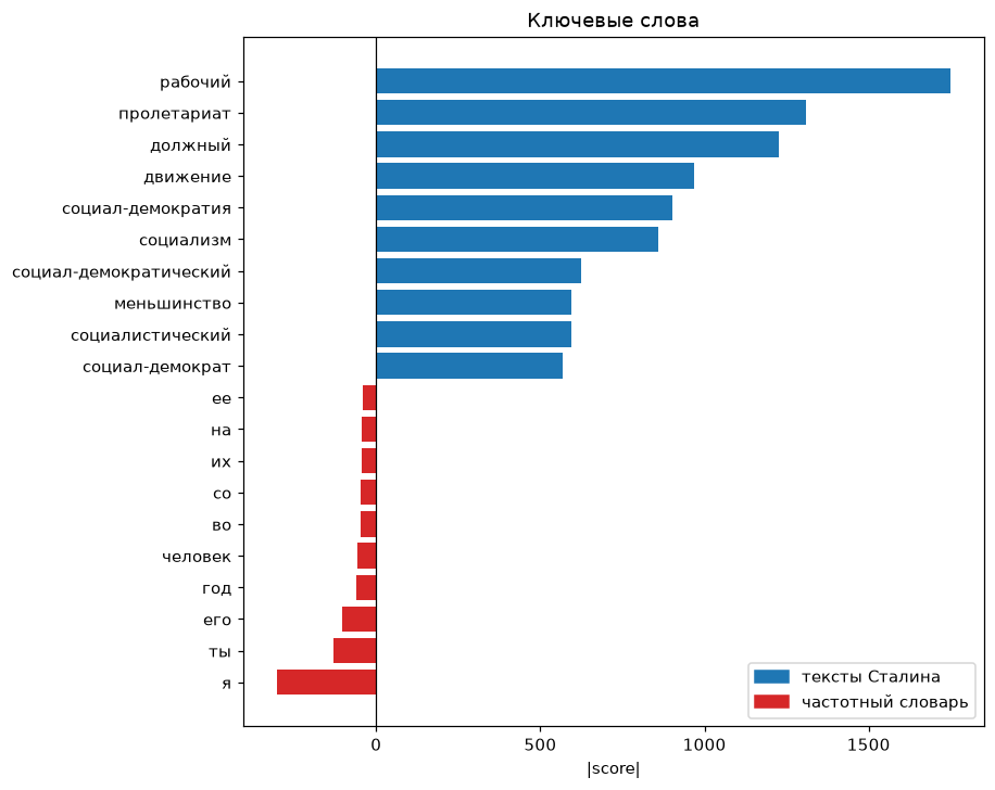
Plots for the corpus measures: lexical dispersion - where in the text a word occurs, a keyness chart from the results of keyness and a collocation network from the results of collocations. The matplotlib functions take axes ax and return Axes: without ax a new figure is created, with ax the plot goes into the user's grid; the collocation network is built by graphviz and returns a Graph, like the word tree.
Lexical dispersion
A row for every word of targets, a tick at the position of each of its occurrences in the text - like dispersion_plot in NLTK and textplot_xray in quanteda. Words are compared as they are: case and lemmatization are up to WordsExtractor, lemma search - via use_lexemes=True.
| Parameter | Type | Default | Description |
|---|---|---|---|
words |
list[str] | - |
Words of the text in order |
targets |
list[str] | - |
Words whose occurrences to show |
ax |
Axes | None |
Axes for the plot |
Keyness chart
Diverging horizontal bars (quanteda textplot_keyness): words from positive to the right, from negative (the result of keyness with positive=False) to the left, bar length is the absolute value of the field (score, g2, log_ratio), so the side is set by the list, not by the sign of the measure; top_n words on each side, words with an undefined or infinite value are skipped. For the odds ratio (score from 0 to infinity, one means equal odds) set log=True: the absolute \(\log_2\) of the value is plotted, symmetric around one.
| Parameter | Type | Default | Description |
|---|---|---|---|
positive |
list[Keyword] | - |
Positive keywords |
negative |
list[Keyword] | () |
Negative keywords |
top_n |
int | 20 |
Number of words on each side |
labels |
tuple[str, str] | ("целевой корпус", "эталонный корпус") |
Legend labels |
field |
str | score |
Keyword field whose values are plotted |
log |
bool | False |
Plot \(\log_2\) of the value - for the odds ratio |
ax |
Axes | None |
Axes for the plot |
Collocation network
An undirected graph (quanteda textplot_network): nodes are words with font size by frequency, edges are pairs with width by the measure value and a label; neato layout. Rendering requires the Graphviz executables; in Jupyter the graph displays itself, graph.render("network", format="png") saves a file.
| Parameter | Type | Default | Description |
|---|---|---|---|
collocations |
list[Collocation] | - |
Collocations |
top_n |
int | None |
Number of pairs from the start of the list; None - all |
Usage example
Let us look at the visualizers on 12 texts of the StalinWorks dataset.
Example
Code:
# Import the libraries
import matplotlib.pyplot as plt
from ruts import WordsExtractor
from ruts.corpus import collocations, keyness
from ruts.datasets import FreqDict, StalinWorks
from ruts.visualizers import collocation_network, dispersion_plot, keyness_plot

# Prepare the data
sw = StalinWorks()
texts = list(sw.get_texts(limit=12))
we = WordsExtractor(use_lexemes=True, lowercase=True, filter_nums=True)
lemmas = [lemma for text in texts for lemma in we.extract(text)]

# Lexical dispersion
dispersion_plot(lemmas, ["партия", "рабочий", "революция", "царь"])

# Keywords relative to the frequency dictionary
freq_dict = FreqDict()
keyness_plot(
    keyness(lemmas, freq_dict, min_freq=5, top_n=10),
    keyness(lemmas, freq_dict, positive=False, min_freq=5, top_n=10),
    labels=("тексты Сталина", "частотный словарь"),
)

# Collocation network
graph = collocation_network(collocations(lemmas, window=3, min_freq=5, top_n=25))
graph.render("network", format="png")
Result: